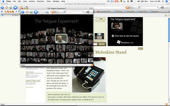
The "Mojave Experiment"
There's a lot to like about this campaign. The banners are placed contextually, so I saw one while reading an article about an Apple product. The microsite pops up but doesn't overtake the content I'm already viewing. And the navigation system is an homage to PicLens, which just looks great.

Blogged with the Flock Browser


No comments:
Post a Comment